c
cc
[Industry]
[My Role]
[Platforms]
[Timeline]
cscscsc
[01] Surveys & Interviews:
Conducted surveys with individuals who had impactful life stories and patients in
oncology wards.
Published research within writing therapy groups, nostalgia groups, and family heritage communities on Facebook.
[02] Key Insights:
Users wanted to write about their childhood and past experiences from a reflective perspective.
Many respondents wished to read the life stories of loved ones after they passed away.
Users struggled to start writing without a structured process or clear steps.
[03] Sample User Questions:
What topics would you like to write about?
What periods in life would you like to reflect on?
What seems most difficult about writing your memories?
Would you like to read the life story of someone close to you?
How much time would you dedicate to writing each memory?

Competitive Analysis
Indirect Competitors:
WhatsApp: Used informally to share memories, but lacks organization and emotional context
❌
Google Drive / Docs: Good for storing content, but impersonal and unstructured
❌
Social Media (e.g., Facebook, Instagram): Present-focused, public, and content fades over time. Not built for deep, personal reflection.
❌
Diary apps: Private and simple, but not suitable for long-term storytelling or legacy
❌
BioMe’s Advantage:
Emotional-first approach
✔️
One app that does it all: writing, organizing, sharing, and preserving
✔️
Features designed for life storytelling - like a personalized timeline, guided questions, and flexible privacy.
✔️
Ability to export the life story as a digital book or printable file
✔️
[Goal]
[Frustrations]
User Flow
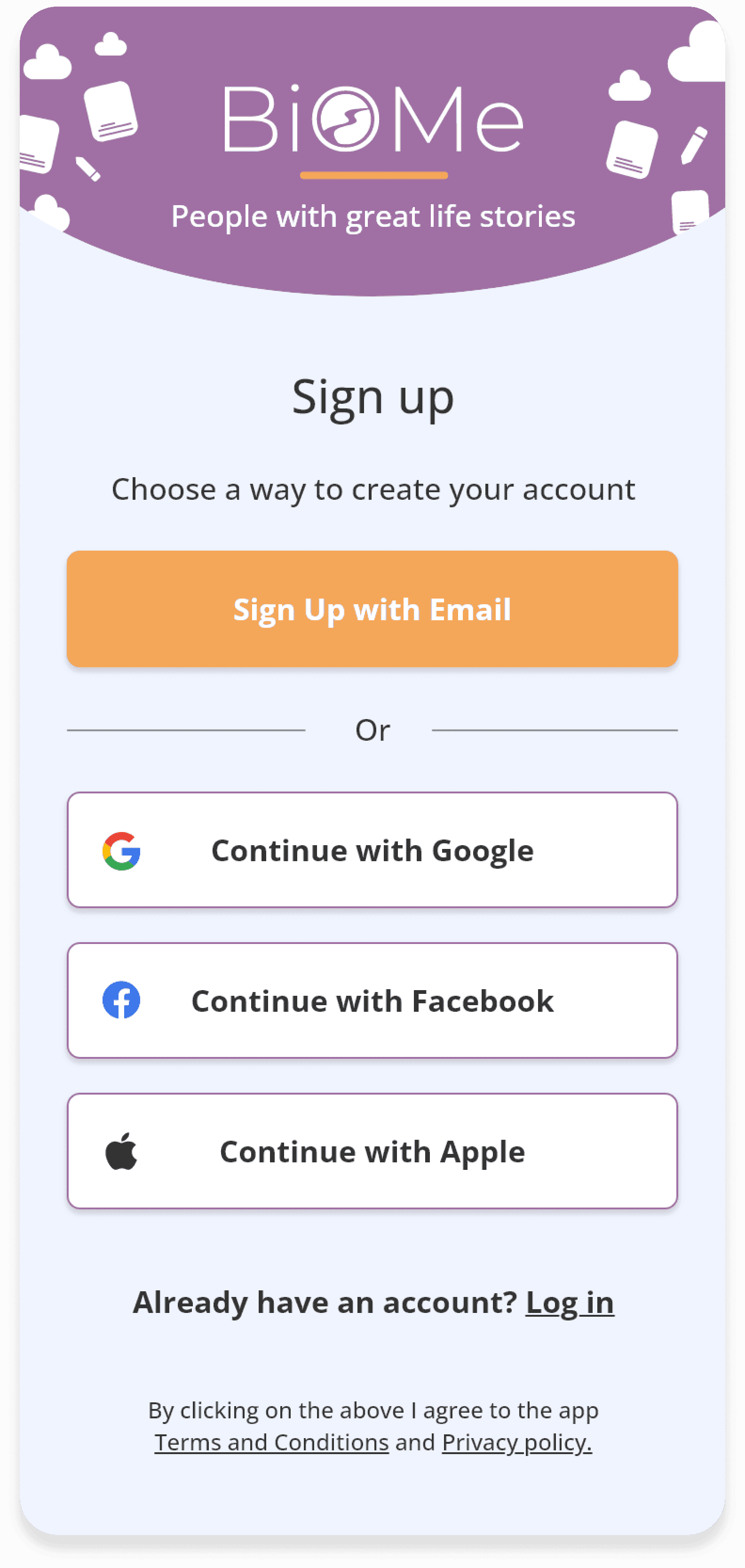
1. Profile creation
The user begins by creating a personal profile.
2. Timeline setup
By selecting their birth year, the system generates a personalized, chronological timeline.
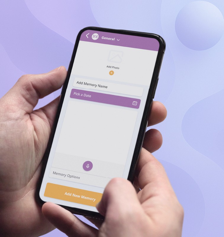
3. First memory entry
The user adds their first memory by setting a date, choosing a category, and uploading content such as text, photo, or audio.
6. Memory collection support
Interactive questionnaires assist the user in recalling and documenting additional memories.
5. Timeline building
Memories are added to the timeline, gradually shaping a structured life narrative.
4. Privacy settings
Each memory includes customizable privacy options - private, shared with selected contacts, or anonymous.
7. Export & legacy
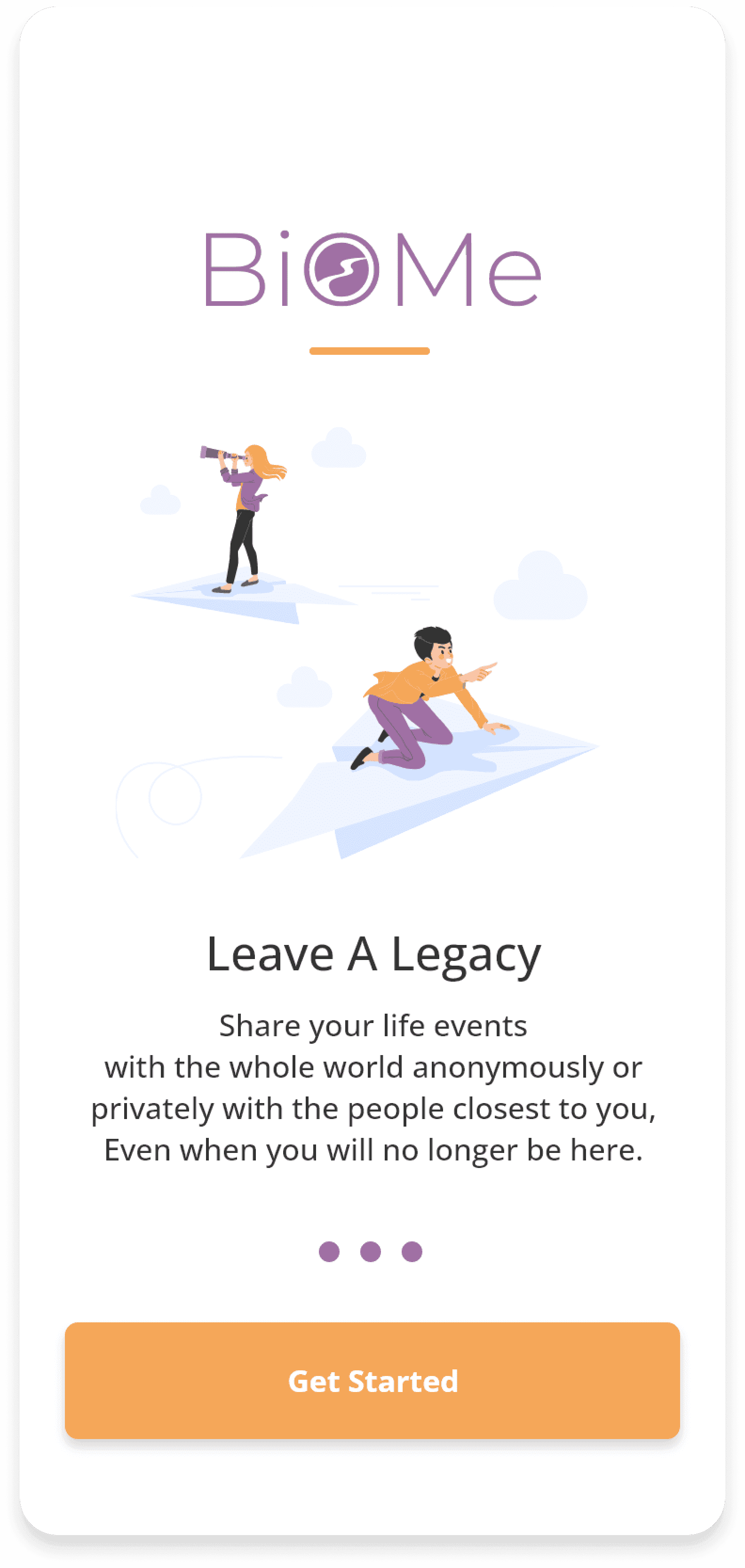
Once the life story is complete, it can be exported as a digital or physical book, or passed on as a legacy to loved ones.
Design Challenges
Design Challenges
This was a rare opportunity to design a product completely from scratch - a process that came with both freedom and responsibility. The biggest challenge was defining how a life story should be told digitally. Should it feel like a diary? A social network? A library?
We needed to find a way to combine elements of each.
The concept was unique, with no direct competitors at the time. Striking the right balance between innovative design and familiar UI/UX patterns was key.
There was also an emotional layer to consider - how to make the experience feel gentle, uplifting, and safe for people revisiting painful or complex life moments.
These early challenges directly informed the visual and interaction decisions that came next.
Wireframes & Early Concepts
I explored initial layout ideas through quick sketches to shape the product’s structure and flow.
Design Decisions
Creating the visual and interaction language for BioMe required both sensitivity and intention. While we followed best practices to ensure usability and clarity, many decisions were shaped by the unique nature of the product, calling for custom solutions that felt personal and intuitive.
Color Palette
I conducted research on color psychology to select meaningful colors:
Purple – Representing imagination, reflection, and spirituality, aligning with the deep emotional introspection required for users to write their life stories.
Orange – Representing optimism, enthusiasm, and youthfulness, symbolizing positive reflection on past experiences.
Main
#A070A4
Backgorund
#EFF4FF
Subheading
#6A6A6A
CTA
#F5A759
Backgorund 2
#C2DBFF
Error
#F5295A
Disabled
#BABABA
Text
#333333
Text Fields
#FFFFFF
Typography
I opted for sans-serif font to ensure a clean, modern, and sophisticated look. Emphasis was placed on readability to enhance the writing experience. Clear typographic hierarchy ensured titles stood out while body text felt smooth and engaging.
Font
Open Sans
Open Sans
Open Sans
Open Sans
Open Sans
Open Sans
Open Sans
Open Sans
Size
25
16
16
16
12
12
12
10
Weight
Meduim
Bold
Medium
Light
Bold
Medium
Light
Light
Purpose
App Titles, Key screens
CTA ,Buttons
Card Titles, Subtitles , Feature Titles
Info, Status
Info,help text
Main paragraph text, Labels, errors
Forms, Secondary info
Disclaimers
Visual Structure & Interaction
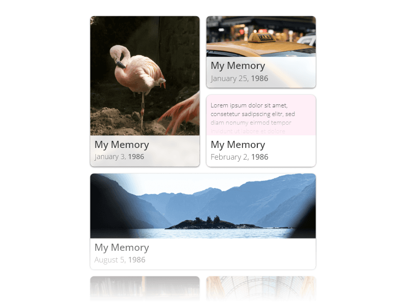
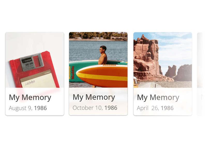
Eventually, I leaned toward treating each memory as a modular “memory card,” containing elements like a date, text, photo, audio, and category. These cards were designed to live along a dynamic timeline that reflects the natural flow of a life.
One of the major interaction decisions was to support both vertical and horizontal scrolling, mimicking the feeling of browsing a bookshelf or flipping through a scrapbook. This subtle, physical metaphor helped users intuitively explore their stories in a more immersive and engaging way.
Style
Rounded cards, soft icons, and vibrant illustrations were used to create a warm, inviting experience. I followed familiar navigation patterns to ensure usability, while adding playful details that made the app feel alive and personal.

Final Design


Key Takeaways
This project taught me that while innovation is important, leveraging familiar design patterns is crucial when building complex products. I learned the value of guiding users through new concepts using intuitive UI flows and established design language.
I also realized how impactful design can be in improving people's emotional well-being, especially when dealing with sensitive topics like life stories and legacy.
What Would I Do Differently?
I would simplify the MVP further to focus on refining the core features like the timeline, questionnaires, and memory-sharing tools.
Reducing complexity earlier in development would have improved user onboarding and retention from the start.